
新建
Bar Color and Bar Label

💎Bohrium官方
推荐镜像 :Basic Image:bohrium-notebook:2023-04-07
推荐机型 :c2_m4_cpu
赞
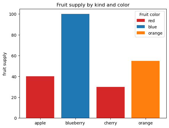
This is an example showing how to control bar color and legend entries using the color and label parameters of bar. Note that labels with a preceding underscore won't show up in the legend.
代码
文本
[1]
import matplotlib.pyplot as plt
fig, ax = plt.subplots()
fruits = ['apple', 'blueberry', 'cherry', 'orange']
counts = [40, 100, 30, 55]
bar_labels = ['red', 'blue', '_red', 'orange']
bar_colors = ['tab:red', 'tab:blue', 'tab:red', 'tab:orange']
ax.bar(fruits, counts, label=bar_labels, color=bar_colors)
ax.set_ylabel('fruit supply')
ax.set_title('Fruit supply by kind and color')
ax.legend(title='Fruit color')
plt.show()
代码
文本
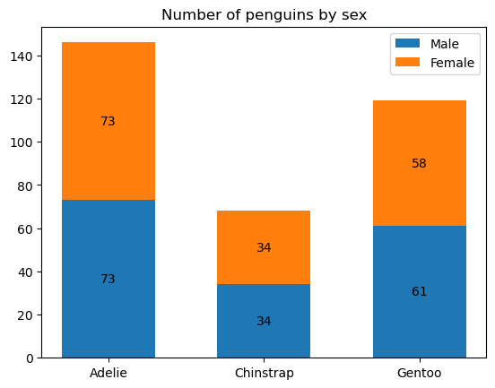
This example shows how to use the bar_label helper function to create bar chart labels.
代码
文本
[2]
import numpy as np
代码
文本
[3]
species = ('Adelie', 'Chinstrap', 'Gentoo')
sex_counts = {
'Male': np.array([73, 34, 61]),
'Female': np.array([73, 34, 58]),
}
width = 0.6 # the width of the bars: can also be len(x) sequence
fig, ax = plt.subplots()
bottom = np.zeros(3)
for sex, sex_count in sex_counts.items():
p = ax.bar(species, sex_count, width, label=sex, bottom=bottom)
bottom += sex_count
ax.bar_label(p, label_type='center')
ax.set_title('Number of penguins by sex')
ax.legend()
plt.show()
代码
文本
Horizontal bar chart
代码
文本
[4]
# Fixing random state for reproducibility
np.random.seed(19680801)
# Example data
people = ('Tom', 'Dick', 'Harry', 'Slim', 'Jim')
y_pos = np.arange(len(people))
performance = 3 + 10 * np.random.rand(len(people))
error = np.random.rand(len(people))
fig, ax = plt.subplots()
hbars = ax.barh(y_pos, performance, xerr=error, align='center')
ax.set_yticks(y_pos, labels=people)
ax.invert_yaxis() # labels read top-to-bottom
ax.set_xlabel('Performance')
ax.set_title('How fast do you want to go today?')
# Label with specially formatted floats
ax.bar_label(hbars, fmt='%.2f')
ax.set_xlim(right=15) # adjust xlim to fit labels
plt.show()

代码
文本
Some of the more advanced things that one can do with bar labels
代码
文本
[5]
fig, ax = plt.subplots()
hbars = ax.barh(y_pos, performance, xerr=error, align='center')
ax.set_yticks(y_pos, labels=people)
ax.invert_yaxis() # labels read top-to-bottom
ax.set_xlabel('Performance')
ax.set_title('How fast do you want to go today?')
# Label with given captions, custom padding and annotate options
ax.bar_label(hbars, labels=[f'±{e:.2f}' for e in error],
padding=8, color='b', fontsize=14)
ax.set_xlim(right=16)
plt.show()

代码
文本
Bar labels using {}-style format string
代码
文本
[6]
fruit_names = ['Coffee', 'Salted Caramel', 'Pistachio']
fruit_counts = [4000, 2000, 7000]
fig, ax = plt.subplots()
bar_container = ax.bar(fruit_names, fruit_counts)
ax.set(ylabel='pints sold', title='Gelato sales by flavor', ylim=(0, 8000))
ax.bar_label(bar_container, fmt='{:,.0f}')

代码
文本
Bar labels using a callable
代码
文本
[7]
animal_names = ['Lion', 'Gazelle', 'Cheetah']
mph_speed = [50, 60, 75]
fig, ax = plt.subplots()
bar_container = ax.bar(animal_names, mph_speed)
ax.set(ylabel='speed in MPH', title='Running speeds', ylim=(0, 80))
ax.bar_label(bar_container, fmt=lambda x: f'{x * 1.61:.1f} km/h')

代码
文本
双击即可修改
代码
文本
点个赞吧
本文被以下合集收录
matplotlib
💎Bohrium官方
更新于 2023-11-13
1 篇0 人关注
推荐阅读
公开
Stacked bar chart etc.💎Bohrium官方
发布于 2023-11-13
公开
Matplotlib
ddr
发布于 2024-03-12